MOZILLA HAS A new logo. Maybe you’ve seen it before—the wordmark, which replaces the “ill” in “Mozilla” with the colon and twin slashes commonly found in URLs, was one of several design candidates the company floated last fall. That was unusual. When a big tech company unveils a new identity, it usually does so with a surprise announcement. There’s a splashy rollout, a how-we-did-it essay on Medium, and critiques from news outlets (like this one!) and the internet at large.
Instead, Mozilla flipped the rebranding process on its headby sharing each step with the masses. The experiment was a response to the vitriolic state of online logo criticism. Rather than defend itself after the fact, Mozilla posted proposed logos from London firm Johnson Banks online, where anyone could comment. Which they did: The Mozilla and Johnson Banks teams reviewed around 3,000 comments during the five-month-long project.
Those comments didn’t count as votes, but they did influence Mozilla’s decision to use this design, which incorporates a fragment of a web address, over the other identities. “Because it has a portion of URL embedded in the middle of the logo, you know this must be some kind of internet company,” says Tim Murray, Mozilla’s creative director. He wanted the new logo to do a few things: First, he wanted to improve public understanding of what Mozilla does. Say Mozilla, and most people think of Firefox, the web browser. But the company produces many products, each meant to promote web literacy and online security. The “://” winks at the company’s expansive internet roots.
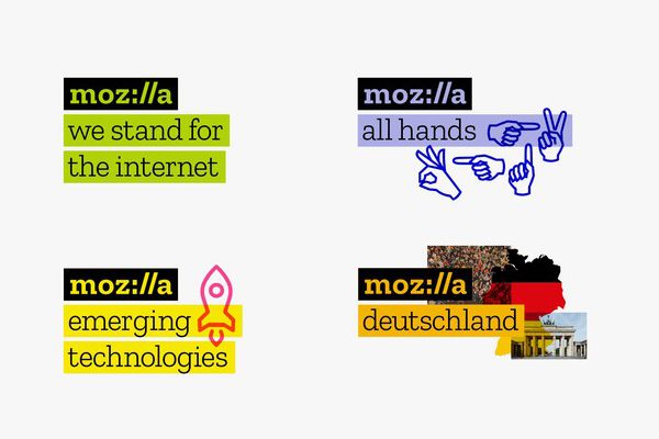
The second thing Murray hopes the new identity will do is work in tandem with the “maker spirit” of the Mozilla community. It should welcome members to play with it. For example, the letters-only logo lets users attach a photo, graphics, or a GIF, without resulting in much clutter. Some of the other final contenders from Johnson Banks contained specific graphics—a cartoon dinosaur head, or fireworks—that would have made such customization difficult. Plus, anyone with a keyboard can type “Moz://a”—no special files necessary.
The most interesting thing about Mozilla’s experimental approach might not be the logo, but how well it seemed to work. “Sometimes people were writing essays about the pros and cons of our seven approaches,” says Michael Johnson, the Johnson Banks creative director in charge of the Mozilla project. Scroll through the comments, like the ones about the “Protocol” logo, and you’ll find a wide range of polite, well-reasoned, and differing opinions.
Some feedback even made its way into the final mark. Several commenters were put off that the original “Protocol” used a capital “M,” when a URL code uses all lowercase letters. The final mark has a lowercase “m.” Other commenters rallied against the idea entirely, calling the “http://” snippet a historical artifact of the web. Murray and Johnson acknowledged those comments, but pressed onward with the idea. After all, you can invite all the feedback you like, but the fact is you’ll never please everyone. Especially not on the internet.
Original Article Credit: Wired Online Publication – Click here to view


